This site serves as the single source of truth for all design and architecture specifications, component and layout behavior across all CMT sites built with this repo.
Reusable UI elements like buttons, cards, forms, and navigation elements.
Layouts
Page templates used across the sites. Each layout page documents
Version Control
All documentation is version-controlled in git alongside the codebase. Visual snapshots from Figma are exported and committed to ensure immutability. Each page displays its last modification date.
2. General
2.1 Technical Requirements
Performance
all of the pages are interactive in less than 2 seconds
websites achieve over 80% in all Lighthouse categories
Security
websites have SSL
SQL injection is not possible
used libraries are up-to-date
spam is prevented on all forms
email address are not included in html
all relevant XSS cross-site scripting protection headers are enabled
production doesn’t include any links to test or staging environment
Browser Support
The sites support the last two versions of major browsers:
Chrome
Safari
Firefox
Edge
Accessibility
All sites meet WCAG AA standards for accessibility.
2.2 Theming
The frontend is designed to be used by multiple brands. They share the same layouts and components, but each brand has a unique visual theme. The theme defines colors, typography, and border radii that align with the brand’s identity.
All theme and brand-specific values are implemented as CSS variables.
Theme primitives
Brand-specific
Each brand theme is built from a small set of theme-specific primitives:
Two base colors. Other surface/text/border/overlay colors are derived from these.
Typography choices. Each theme defines its own font family and font weights.
Border radius. Each theme defines its own radius scale.
Shared
Font sizes
Spacings
All colors except 2 base colors
Shadows
Breakpoints
Grid system
Colors
Colors are grouped based on purpose into:
Text on surfaces (backgrounds)
Text on media (images/videos)
Surfaces
Borders
Overlays
Typography
Only Google Fonts are used to ensure optimal performance and reliability. Each theme defines its own font family and weights, but all themes share the same font size scale.
2.3 Spacing and Sizing
The spacing and sizing system defines consistent space and dimensions across all components and layouts. It uses CSS variables that automatically scale from desktop to mobile, ensuring consistency and responsive behavior across all brands.
Soft Scale
Used for ~90% of spacing needs. Values decrease gradually (linearly) from desktop to mobile.
Primary use: Gaps, margins, paddings, and sizing for icons, badges, and small images.
Hard Scale
Values decrease by half for more dramatic scaling. Used for main section DIVs and specific cases requiring sharper reduction.
Primary use: Section-level spacing and containers.
Variable Scale
Custom scaling for contexts where flex direction changes and spacing needs may vary (increase, decrease, or stay the same).
Primary use: Gaps that transition from horizontal to vertical layouts.
To Zero Scale
Desktop values reduce to zero on mobile to maximize space.
Primary use: Decorative paddings and offsets that can be removed on mobile.
From Zero Scale
Zero on desktop, scales up on mobile (inverse of To Zero Scale).
Primary use: Spacing that’s only needed on mobile devices.
Site-Specific Variables
Certain values are brand-specific (Collegium, Mondial) for grid and navigation spacing:
Property
Desktop
Mobile
12-col
1392
1392
Navi offset
76
113
Navi offset with announcement strip
118
150
Site-specific variables:
--navi-offset: Navigation offset (varies by breakpoint)
--navi-banner-offset: Navigation offset with announcement banner (varies by breakpoint)
2.4 Internationalization (i18n)
CMT sites styles allows for each site to be multilanguge. The frontent i18n is handled by Hugo, Decap handles CMS translations. Both content and template strings can be translated and edited. user selects the preferred language via a language switcher component. The default language is set in the site config file (hugo.toml).
When enabling i18n for a site, the client defines which language is the default.
2.5 3rd-Party Services
A list of third-party services used across CMT sites, including content management, hosting, media delivery, and analytics.
Consent tool will be chosen by CMT, PM helps with implementation.
Responsibility: Cookie handling and configuration is the client’s responsibility.
Implementation support: The PM team provides technical assistance with chosen tool integration and implementation.
Cookie Sources
PM does not implement any cookies for website development purposes. All cookies on the site originate exclusively from third-party services added by GTM (analytics, marketing tools, embeds, etc.).
Google Tag Manager (GTM)
PM integrates GTM into the site
Client provides the GTM container ID
Cloudflare Forms
Form submissions are processed through Cloudflare static forms and stored in Cloudflare’s system. Cloudflare acts as a data processor for all submitted form data.
Client responsibilities:
Ensure GDPR-compliant data processing agreement with PM
PM responsibility:
Technical integration
Manage form submissions via Cloudflare account
Privacy Policy
The client is responsible for maintaining their own privacy policy.
Brand colors (primary, secondary with 100/120 variants)
Accented colors (text, surfaces, borders)
Font families (display, heading, title, body, label, supporting, button)
Font weights for each family
4. Content & Data Files
Content:
content/{brand}/_index.{lang}.md - Homepage for each language
Data files in data/{brand}/:
footer.json - Footer links, social media, contact info
5. Static Assets
Directory:static/{brand}/
favicon.png - Site favicon
6. Cloudflare Deployment
Create Pages project: cmt-{brand}
Connect to GitHub repository
Add required environment variables:
HUGO_VERSION (e.g., 0.154.5)
NODE_VERSION (e.g., 20)
…
Disable automatic deployments - we use GitHub Actions for builds instead
Timeline
The deadline for creating a new site is 5 working days since the client provides all necessary inputs defined above. The client must inform the contractor 2 weeks in advance about the intention to create a new site.
2.8 CMS
The project uses Decap CMS as the content management system. We subscribe to Decap Turbo upgrade.
There is no centralized CMS that allows editing multiple sites simultaneously. Each site’s content is managed through its own dedicated CMS interface.
User Roles and Permissions
The CMS implements a role-based access control system with different permission levels:
Admin - Full access to all collections and CMS settings
Editor roles - Limited access based on specific collection permissions
Editor roles are configured to allow access only to designated collections, ensuring content editors can modify only the content areas relevant to their responsibilities.
Role definitions and permissions are determined by the PM, Poslovni mediji.
Note: User roles will be configured after all brands included in the first contract are set up and deployed.
SEO
Global settings:
Favicon
Site title
Site title suffix (added to subpages)
Site description
Site OG image
Page settings:
Page title
Page description
Slug
Page image
Page OG settings:
OG title
OG description
OG image
Each setting overrides the corresponding parent setting.
Example: if OG image and Page image fields are not set, Site OG image is displayed for that page i nthe og:image tag. If page image is added, og:image tag is the page image. If field OG image is set, tag og:image displays OG image.
2.9 Forms
Basic forms
They can be constructed via the CMS without the need for developers to set them up.
Fields in basic forms can include:
Text input
Email input
Textarea
Dropdown of text options
Checkbox group
Radio button group
Text paragraphs and headings can be added between fields.
A basic form will include a submit button, a success message, and an error message.
CMS editor will be able to set recipient email addresses for form submissions.
Complex forms
A developer sets up the form and configures strings to be editable in the CMS.
For example: contact form is hardocded and documented on Contact Form page.
Processing form submissions
We have 2 options. Both use Cloudflare Pages Functions for the server-side handler, but they differ in portability and vendor coupling.
Option A: Cloudflare Static Forms Plugin (CF-specific)
What it is:
A Pages Plugin that intercepts forms with the data-static-form-name attribute, parses the submission, and calls a respondWith handler in a Function.
Pros:
Fast setup for basic forms (no custom routing)
Works well for simple email forwarding
Officially supported and production-ready (last updated Sep 15, 2025)
Cons:
Cloudflare-only (not portable to Netlify/Statichost)
Still requires a Function to send email and handle validation
Less flexible for future integrations
Best for:
Simple forms that will stay on Cloudflare Pages
Option B: Custom Function + Brevo API/SMTP (Portable)
What it is:
A custom endpoint (e.g. /api/forms/submit) that accepts form posts, validates them, and sends email via Brevo (API or SMTP).
Pros:
Low vendor lock-in (easy to move to Netlify, Vercel, or a custom server)
Full control over validation, rate limiting, and spam protection
Easy to extend for future booking API integration
Email deliverability and GDPR tooling via Brevo
Cons:
More setup and maintenance than the plugin
More expensive if using Brevo API for high volume (SMTP is cheaper but less feature-rich)
Best for:
Forms that may evolve (auto-response, integrations, advanced logic)
Minimal friction if hosting changes
Recommendation
Use Option B (Custom Function + Brevo API/SMTP).
It minimizes vendor lock-in while still working on Cloudflare today.
It keeps GDPR-sensitive data flow under your control.
It supports future integrations without re-architecture.
2.10 Phase 2
Some features are drawn in Figma but are not part of the original contract. These are potential features that may be added in a future phase, but are not currently planned for development.
Dark mode
Advanced animations
Pages for guides
Video background support for hero components (in addition to images)
3. Components
Each component page includes:
Name
Description and purpose: What the component is for and when to use it
Properties: Different versions of the component (e.g., state: default, hover, active, disabled; responsive: desktop, mobile)
Visual Snapshots: Figma exports showing examples of each property
Behavior (User-facing): How it responds to interaction, validation rules, error states
Behavior (Admin/CMS): How content editors configure it in Decap CMS
Responsive Rules: How it adapts across breakpoints (xs, sm, md, lg, xl, xxl, xxxl)
Dependencies: Related components, JavaScript modules, or feature flags
3.1 Header
The Header component provides site navigation and branding. Shows brand logo, website switcher dropdown, main navigation menu with dropdown submenus, optional CTA button, and responsive mobile hamburger menu. Main navigation supports up to 2 levels of navigation (main items + one level of submenus/dropdowns).
A site-wide horizontal banner displayed above the main navigation for announcements or promotional messages. Features scrolling text on mobile and optional CTA button. Text has a 100 character limit to remain on a single line within the desktop container. Same banner appears across all pages.
Main navigation bar container for site header. Contains brand logo, website switcher dropdown (optional), horizontal navigation menu (optional), and CTA buttons (optional). Features responsive design with hamburger menu on mobile.
The Navigation Link Group component displays a grouped set of related navigation links. Used as part of the header navigation to organize links by category or topic.
A dropdown popover component that allows users to select their preferred language for viewing the website. Displays available language options with flag icons and language names. Appears in the header as a button showing current language and a globe icon.
3.2 Navi Section
Main navigation bar container for site header. Contains brand logo, website switcher dropdown (optional), horizontal navigation menu (optional), and CTA buttons (optional). Features responsive design with hamburger menu on mobile.
Functional Documentation
Role
Scenario
Description
system
Display navigation section
Shows brand logo, optional website switcher dropdown, optional horizontal navigation menu with page links, and optional CTA buttons on desktop. Switches to mobile hamburger menu on smaller viewports.
system
Display mobile navigation
On mobile, shows logo and hamburger icon. Clicking hamburger opens slide-out menu with navigation items.
editor
Configure brand logo
Upload brand-specific logo for navigation section. Logo links to homepage. Supports different logos per brand (Collegium, Mondial, Cooltura, BW).
editor
Configure website switcher
Optional website switcher displays available brand sites (Collegium, Mondial, Cooltura, BW etc.). Current site is shown with dropdown arrow. Label text "Naša spletna mesta:" precedes dropdown.
editor
Configure navigation menu
Optional horizontal navigation menu. Each menu item requires label, optional icon, and URL. Supports nested submenu items organized in groups. Menu items can be reordered. Active page highlighting is automatic.
editor
Configure CTA buttons
Optional CTA buttons can be added to navigation section (e.g., "Pomoč in podpora"). Requires label and URL. Displays as outlined button style.
user
Use navigation section
Click logo to return to homepage. Use optional website switcher to navigate between brand sites. Click optional navigation menu items to navigate. Click optional CTA buttons to perform actions.
user
Use mobile navigation
On mobile, click hamburger icon to open/close slide-out menu with navigation items.
Properties
Responsive (Variant)
Value
Example
Desktop
Mobile
3.3 Navi Announcement Strip
A site-wide horizontal banner displayed above the main navigation for announcements or promotional messages. Features scrolling text on mobile and optional CTA button. Text has a 100 character limit to remain on a single line within the desktop container. Same banner appears across all pages.
Functional Documentation
Role
Scenario
Description
system
Display announcement strip
Shows banner above main navigation with announcement text and optional CTA button. Text scrolls horizontally on mobile if it exceeds viewport width.
editor
Configure announcement text
Set announcement message text. Maximum 100 characters to ensure single-line display on desktop container. Text will auto-scroll on mobile if needed.
editor
Configure CTA button
Optional CTA button can be added to announcement strip. Requires button label and URL. Displays as button component within the strip.
user
Read announcement
View announcement message in magenta banner at top of page. On mobile, text auto-scrolls if message is longer than viewport width.
user
Click CTA button
Click optional CTA button in announcement strip to navigate to related page or perform action (e.g., "Learn more", "Register now").
Properties
Responsive (Variant)
Value
Example
Desktop
Mobile
3.4 Footer
Multi-column footer section with site branding, navigation links, support information, and related site logos. Adapts across different brand sites (Collegium, Mondial, Collegium CRO, Cooltura) and responsive breakpoints.
Functional Documentation
Role
Scenario
Description
system
Display primary section
Shows logo with gradient line separator, followed by columns of navigation links and an outlined support section. Content adapts based on brand site variant.
system
Render headline link indicator
When a column headline is configured as a link, the system automatically renders a right-facing arrow indicator next to the title and marks the element as interactive at render time.
system
Choose footer type per page
When creating a page, select whether it uses the default site footer or an independent site footer variant. The chosen option determines which footer content and layout are rendered for that page.
system
Display secondary section
Shows related site logos with gradient line separator and copyright text. Logo count and arrangement adjusts per brand.
system
Stack sections on mobile
On mobile, columns reflow to vertical stacking with reduced padding and adjusted spacing. Logos display in one horizontal line when space allows, wrapping to multiple rows if too many are present.
editor
Configure navigation columns
Each column contains a headline (uppercase) with arrow icon indicator (if href is also added), and list of links. Number of columns may vary depending on the brand.
editor
Configure support box
Outlined column displays headline, descriptive text, and call-to-action button with arrow icon. Text content is editable.
editor
Configure footer links
List items within columns are editable. Links can be added, removed, or reordered.
All footer links are clickable and navigate to their configured destinations. Column headers (e.g., "Doživetja") are clickable links if a corresponding listing/archive page exists for that category; otherwise they remain as static headings.
user
Click support button
Button in outlined column displays hover state and navigates to support or help page when clicked. Contains label and right-facing arrow icon.
Properties
Responsive (Variant)
Value
Example
Desktop
Mobile
3.5 Breadcrumbs
Breadcrumbs provide navigation path showing the user's location within the site hierarchy. Displays page ancestors separated by chevron icons with interactive links to parent pages.
Properties
Layout
Value
Example
Default
State (Variant)
Value
Example
Default
Hover
Hover
3.6 Button
The button component is the primary call-to-action element used throughout the site. It can navigate to internal pages, external pages, anchor links on the same page, or trigger actions such as form submissions. For buttons with icons, editor can select icon from a predefined list of available icons.
Properties
State (Variant)
Value
Example
Default
Hover and Active
Focused
Loading
Disabled
Appearance (Variant)
Value
Example
Filled
Outlined
Text
Icon placement (Variant)
Value
Example
Both sides
Right side
No icons
Icon only
Size (Variant)
Value
Example
Large
Medium
Special (Variant)
Value
Example
Play button
3.7 Gallery
Gallery preview with image grid and optional video embed (YouTube or Cloudinary-hosted). Shows 3-4 preview images with plus N button indicating additional images. Video section has play button overlay. Opens full gallery lightbox or video player on click.
Functional Documentation
Role
Scenario
Description
system
Display gallery layouts
Shows image grid with 3 preview images and a "+N" button displaying the count of additional images (e.g., "+12" means 12 more images available). Optional video section with title and play button. When present, the video occupies the left column on desktop and stacks above the images on mobile — the video takes the first place where the leading image would otherwise appear. Note: the video opens using the site-wide lightbox/player plugin (may be slightly different from the image lightbox behaviour).
editor
Configure optional video
Video is optional. Editor may add a video with title and a play-button overlay. If a video is added, it replaces the leading image position in the gallery layout. Supported sources: YouTube or Cloudinary-hosted video; editor provides video URL and optional poster image.
user
View gallery and video
Click plus button to open full gallery lightbox. Click play button to watch video. Click any image to open lightbox at that image.
Properties
Responsive (Variant)
Value
Example
Desktop
Mobile
3.8 Independant Site Footer
Footer component for independent brand sites (e.g., Balkan Wave). Contains brand logo, company name, and multiple link columns organized by category. Features responsive layout with columns stacking vertically on mobile.<br><br>*Note: Check with Damir where this footer is used (product single for BW?).
Functional Documentation
Role
Scenario
Description
system
Display footer content
Shows brand logo, company name "CMT group d.o.o.", and organized link columns. First column contains festival information links, second column contains other information and legal links. Each column has category heading in uppercase followed by list of links. Links in the "O FESTIVALU" column should be configured as anchor links (internal page anchors) that scroll to the corresponding section on the same page.
editor
Configure footer links
Set footer logo, company name, and organize links into columns with category headings. Each link requires label and URL. Links can be grouped under uppercase category headings (e.g., "O FESTIVALU", "DRUGE INFORMACIJE").
user
Navigate footer links
Click any footer link to navigate to corresponding page. Links show hover state on interaction.
Properties
Responsive (Variant)
Value
Example
Desktop
Mobile
3.9 Social Media Carousel
A full-width section showcasing actual social media posts in a horizontal scrolling carousel, with heading, social media icon buttons, and post preview cards with video/image content. Used to display recent social media activity and encourage users to follow brand's social channels.
Functional Documentation
Role
Scenario
Description
system
Display social media feed
Shows section with heading, social platform icon buttons, and horizontal carousel of social media post previews (videos/images in rounded cards). If there are more than five posts, the carousel enables a slow autoplay animation that advances to the next card automatically; autoplay should pause on hover or when the user interacts with the carousel controls.
editor
Edit section heading
Edit section heading. Social media posts are automatically fetched from connected platform.
user
View social posts
Read heading and click social platform icons to visit profiles. Scroll horizontally through post preview cards to see brand's social media content.
Properties
Responsive (Variant)
Value
Example
Desktop
Mobile
3.10 Product Text Offer
A comprehensive product offer section displaying included items, upgrades, exclusions, and optional package cards with legal disclaimers. Used for detailed product breakdowns and travel packages.
Functional Documentation
Role
Scenario
Description
system
Display product breakdown
Shows section with optional three-column lists (included/upgrades/excluded items), optional product package cards, and optional legal disclaimers. All list items and package cards open the Content Popover when clicked to show detailed information without navigating away from the page.
editor
Configure offer details
Edit section heading and description. List columns, package cards section, and legal text are optional sections that display when added. Edit list items and package card content.
user
Review offer details
Read product inclusions, optional upgrades, and exclusions. View optional package cards with "Več informacij" links for more details. Clicking any list item or package card opens the Content Popover with the item's full details.
Properties
Responsive (Variant)
Value
Example
Desktop
Mobile
3.11 Anchor Link Group
A horizontal group of clickable cards displaying statistics with numbers, descriptions, and anchor arrows. Used for quick navigation to different page sections with visual statistics.
Functional Documentation
Role
Scenario
Description
system
Display anchor navigation
Shows horizontal row of equal-width cards, each with large number at top, descriptive text in middle, and yellow arrow button at bottom. Cards have light border and rounded corners. Titles/descriptive text are provided as translationsand are expected to be supplied via the i18n/translation files.
editor
Configure anchor links
Editor can add an anchor link and a numeric value for each card.
user
Navigate to section
Click any card to smoothly scroll to corresponding page section. Arrow button indicates clickable nature and scroll direction.
Properties
Responsive (Variant)
Value
Example
Desktop
Mobile
3.12 Anchor Cards
The Anchor Cards displays a grid of clickable feature cards with icons, titles, descriptions, and call-to-action buttons. Includes optional heading and body text. Cards display key benefits or selling points in a visually organized layout.
Functional Documentation
Role
Scenario
Description
system
Display section title
Shows heading and body text when present. Title area does not display when not present.
system
Display card grid layout
Cards display in 4-column horizontal grid on desktop, single-column stack on mobile.
system
Display card content
Each card shows circular icon with brand color background, bold title text, body text description, and outlined button with label and arrow icon.
editor
Add section title content
Heading (optional) and body text (optional, can include multiple paragraphs).
editor
Add and configure cards
Create up to 4 cards. Each card requires icon, title text, description text, and button with label and URL. URLs are typically anchor links to sections below on the same page.
user
Click card button
Navigates to destination URL (typically anchor link to section below on the same page). Button shows hover state on hover.
Properties
Responsive (Variant)
Value
Example
Desktop
Mobile
3.13 Anchor Link Navigation
The Anchor Link Navigation component displays a navigation menu with links to different sections within the same page. Shows section links that smooth scroll to corresponding content when clicked.
Functional Documentation
Role
Scenario
Description
system
Display anchor links
Shows horizontal or vertical list of links to page sections. Becomes sticky when user scrolls to the component, remaining fixed at top of viewport for easy navigation.
system
Highlight active section
Currently visible section's link displays with active state styling: border around the link and different background color to distinguish it from inactive links. As the user scrolls the page, the active link updates automatically to reflect the section currently in view.
editor
Configure anchor links
Links are manually configured. Each link includes a label and target section ID.
user
Navigate to section
Click link to smooth scroll to corresponding section. Link shows hover state on hover.
Properties
Responsive (Variant)
Value
Example
Desktop
Mobile
3.14 Archive Groups (Experience Archive Categories)
The Experience Archive Categories component displays category filters or navigation for browsing experiences. Shows category names with counts and links to filtered views.
Functional Documentation
Role
Scenario
Description
system
Display categories
Shows category list or grid with category names and optional item counts. Categories are only displayed if they contain at least one experience. Category order is consistent across all views.
system
Highlight active category
Currently selected category displays with active state styling.
editor
Configure categories
Categories are automatically generated from content taxonomy.
user
Filter by category
Click category to filter experiences. Shows hover state on hover.
Properties
Responsive (Variant)
Value
Example
Desktop
Mobile
3.15 Archive Slider (Current Experiences and Events A)
Section displaying two content categories - "Aktualna doživetja" (Current Experiences) and "Aktualni dogodki" (Current Events). The experiences section shows product/travel listings with background images, dates, titles, pricing, and inventory badges (Novo/Razprodano). The events section displays event cards with background images, dates, titles, and venue information. Both sections include horizontal scrolling with pagination dots and navigation arrows.
Functional Documentation
Role
Scenario
Description
system
Display content sections
Shows two sections - first slider with product cards (pricing, inventory badges, dates) and second slider with event cards (dates, venue). Both sections display in horizontal carousel with pagination dots and navigation arrows. Arrows show disabled state when at first/last slide.
editor
Configure section
Section heading and cards are automatically pulled from system - content is globally configured and not manually added by editor.
user
Browse content
Use navigation arrows or pagination dots to scroll through carousel items in each section. Left arrow is disabled on first slide, right arrow is disabled on last slide.
user
Click card
Click product or event card to navigate to detail page. Shows hover state on interaction.
Properties
Responsive (Variant)
Value
Example
Desktop
Mobile
3.16 Archive Slider (Current Experiences and Events B)
The Current Experiences and Events component displays a curated list or grid of ongoing and upcoming experiences and events. Shows key information like dates, titles, and brief descriptions with links to detailed pages.
Functional Documentation
Role
Scenario
Description
system
Display content sections
Shows multiple content sections with headings. Displays promotional cards (yellow cards with large images and call-to-action buttons), followed by product/event cards with image, date, title, description, and pricing in grid layout on desktop, stacked on mobile. Shows hover state on hover.
system
Filter by date
Shows only current and upcoming events. Past events do not display.
editor
Configure section
Content cards are automatically pulled from system. Editor can manually add yellow promotional cards with custom images and call-to-action buttons.
user
Browse content
Scroll through sections and use navigation arrows to view more items in each category.
user
Click card
Navigates to detail page. Shows hover state on interaction.
Properties
Responsive (Variant)
Value
Example
Desktop
Mobile
3.17 Contact Form
The Contact Form component provides a form for visitors to submit inquiries or messages. Includes configurable input fields (such as name, email, phone, subject, message, etc.) with validation and feedback messages on submission. Form submissions are handled using Cloudflare Pages static forms plugin.
Functional Documentation
Role
Scenario
Description
system
Display form structure
Shows a left panel with a heading and description text, alongside the form organized into sections with titles (e.g., contact details, trip details). Each section contains input fields with labels, placeholder text, and required field indicators (asterisk).
system
Add dynamic tour/activity entries
In trip inquiry forms, displays a section where users can dynamically add multiple tour or activity entries using an add button. Each entry can be filled with specific details about desired activities during the trip.
system
Request suggested itinerary
Shows an optional checkbox labeled "Ne vem kakšen bo program, želim predlog". When checked, the user can request a suggested itinerary and is not required to list individual activities.
system
Validate input
Validates required fields and email format before allowing submission. Shows error messages for invalid inputs.
system
Determine required fields
The system determines which fields are required.
system
Handle submission
Shows success message on successful submission or error message on failure.
editor
Customize title and description
Change translation strings for the form (labels, headings, placeholders).
user
Complete and submit form
Fill in form fields and click submit button. Receives feedback on submission success or errors.
Properties
Responsive (Variant)
Value
Example
Desktop
Mobile
3.18 Content Popover
A modal overlay component designed to display detailed information across various content types. Features a semi-transparent backdrop with a centered white card containing title, optional tag badge, a single image or multiple images (image carousel) with navigation, and rich text content. Responsive design with mobile-optimized layout.
To simplify the handoff of information across the many different content types the client wants to present, such as:
- Product CTA box explanations
- Product events and activities
- Product artists and guests
- Product venues
- Product offer items
- Product optional packages
A single Content Popover component was created that can handle all of these use cases with consistent interaction patterns and responsive behavior.
Functional Documentation
Role
Scenario
Description
system
Open popover overlay
When user clicks a trigger element (e.g., info icon, "Read more" button), the popover appears as a full-screen modal overlay with semi-transparent backdrop.
system
Display header with title and optional tag
Header section shows component title. If applicable, displays an inherited tag badge (e.g., "Day party" from event type) with icon and brand accent color.
system
Render image carousel
Images display in a grey background container (elevated-a surface). Desktop shows side-by-side with navigation arrows (previous disabled when on first image, next active). Mobile shows single image with page indicator dots below.
system
Display rich text content
Text column shows paragraphs, bold headings, and bulleted lists. Vertical scrollbar appears when content exceeds container height.
system
Close popover
Close button positioned top-right. Clicking closes the popover and returns user to previous view.
editor
Configure popover title
Set the heading text that appears in the header section.
editor
Add popover text content
Compose rich text content. Supports paragraphs, bold text, bulleted lists, and semantic HTML. Content automatically wraps and scrolls if it exceeds vertical space.
editor
Upload images
Add one or multiple images to the image carousel. Images are automatically fitted to container with object-contain to preserve aspect ratios. On desktop, users can navigate with arrow buttons; on mobile, swipe gestures work with page indicators.
user
Navigate image carousel
Desktop users click previous/next arrow buttons to browse images. Mobile users swipe horizontally. Current position indicated by page dots (active dot is highlighted). Disabled arrow indicates first/last image.
user
Scroll long content
When text content exceeds visible area, a vertical scrollbar appears on the right edge. Users scroll with mouse wheel, trackpad, or touch gestures to read full content.
user
Close popover
Click the close button (× icon) in top-right corner and return to the previous view.
Properties
Responsive (Variant)
Value
Example
Desktop
Mobile
3.19 CTA Box
The CTA Box component displays a sticky call-to-action box with promotional content and action buttons. Appears on product hero and overlays the next module on the right side while scrolling.
Functional Documentation
Role
Scenario
Description
system
Display CTA Box
Box is visible on product hero and remains sticky, overlaying the next module on the right side as user scrolls.
system
Display default content
The CTA box displays default content including special selling text, price information, action buttons (Rezerviraj zdaj, Poglej ponudbo), and purchase reassurance text. When applicable, it also shows contingent step arrows and a "Zakaj prej = ceneje?" link that opens a content popover. Some content elements will be dynamically pulled from the booking system.
editor
Configure CTA content
Manually enter parts of CTA box content. If custom content is added, it overrides the default "Zakaj prej = ceneje" content.
editor
Configure CTA buttons
Set button labels and actions. Buttons lead to content popover.
user
Click CTA button
Opens content popover with additional information or booking options.
Properties
State (Variant)
Value
Example
On sale
Sale ended
Sold out
Planned
3.20 Ecommerce Product Hero
Full-screen hero section with image background, countdown timer, event title and metadata, and integrated CTA box with pricing and booking options.
Functional Documentation
Role
Scenario
Description
system
Display hero section
Displays full-screen hero with image background and gradient overlay (top and bottom for dramatic lighting and readability). Shows optional countdown timer with four boxes (days, hours, minutes, seconds) with semi-transparent backgrounds, heading, location with pin icon, dates with calendar icons, and urgency messaging with tier arrows. Uses responsive spacing variables for navigation offset, padding, and CTA positioning. On desktop, positions CTA box in right column. On mobile, overlaps CTA box below hero content.
editor
Configure display
Set event title, location, dates, optional countdown timer and background image.
user
View event information
Sees full-screen hero with high contrast countdown timer, title, location, dates, early bird pricing message with tier arrows, and pricing comparison with discounted price, strikethrough original, and discount badge. Responsive layout shows two-column layout on desktop with CTA box alongside content, or card-like floating CTA box on mobile with hero content below.
user
Take action
Clicks primary "Reserve now" or secondary "View offer" button.
Properties
Responsive (Variant)
Value
Example
Desktop
Mobile
3.21 General FAQ
The General FAQ component displays frequently asked questions in an expandable accordion format. Shows list of questions that expand to reveal answers when clicked.
Functional Documentation
Role
Scenario
Description
system
Display FAQ list
Shows questions in accordion format. Only one answer expanded at a time or all collapsed by default.
system
Display question and answer
Question displays with expand icon indicator. Answer text displays when expanded with smooth transition.
editor
Add FAQ items
Each FAQ item requires question and answer text. Items can be reordered. Supports rich text formatting in answers.
user
Expand answer
Click question to expand/collapse answer. Shows hover state on hover.
Properties
Responsive (Variant)
Value
Example
Desktop
Mobile
3.22 Graduation Experience Terms Archive
The Graduation Experience Terms Archive component displays available graduation experience dates or terms. Shows schedule information with booking availability and pricing details.
Functional Documentation
Role
Scenario
Description
system
Display terms list
Shows available graduation experience terms in list or grid format with dates, availability status, and pricing.
system
Display term details
Each term shows date range, destination, availability status (available, limited, sold out), and price.
system
Show availability status
Terms display availability indicator. Sold out terms may be visually de-emphasized.
system
Sort terms automatically
Terms are automatically sorted by date order (chronological).
system
Price categories
5 price categories are pre-defined in the system.
editor
Configure term display
Set sorting order and filtering options. Terms are automatically populated from booking system.
editor
Manage term availability
Manually input how sold out individual terms are (availability percentage).
editor
Configure CTA box
Manually enter CTA box content. Buttons in CTA box lead to content popover.
user
Select term
Click term to view details or proceed to booking. Shows hover state on available terms.
Properties
Responsive (Variant)
Value
Example
Desktop
Mobile
3.23 Guide List
The Guide List component displays a structured list or grid of guides, articles, or resources. Shows preview cards with title, excerpt, and link to external social media content (Instagram or LinkedIn).
Functional Documentation
Role
Scenario
Description
system
Display guide content
Each guide card shows thumbnail image, title and links to social media platform (Instagram, LinkedIn, Facebook).
editor
Add and configure guides
Add guide cards with title, image, and external link to social media content (Instagram, LinkedIn, Facebook URL).
user
Click guide link
Opens social media post (Instagram or LinkedIn) in new tab. Icons shows hover state on hover.
Properties
Responsive (Variant)
Value
Example
Desktop
Mobile
3.24 Help Center Contact
Contact options section displaying support availability, contact methods (email, WhatsApp, phone), and office visit information. Includes title, description text, and multiple call-to-action buttons.
Functional Documentation
Role
Scenario
Description
system
Display remote contact section
Shows section title, office hours text, and three contact buttons (email, WhatsApp, phone).
system
Display office visit section
Shows section title, availability text, and location button with address.
system
Display contact buttons with icons
Each button has icon (email, WhatsApp, phone, location) and label text. Buttons have outlined style with border.
editor
Configure section titles
Set title for remote contact section and title for office visit section.
editor
Configure contact information
Set office hours, support availability text, email address, WhatsApp number, phone number, and physical address.
editor
Configure button links
Set mailto link for email, WhatsApp URL, phone tel link, and Google Maps link for location.
user
Contact support remotely
Clicks email, WhatsApp, or phone button to initiate contact via preferred method.
user
Visit office
Clicks location button to view address on map and plan visit during office hours.
Properties
Responsive (Variant)
Value
Example
Desktop
Mobile
3.25 Help Center Group
Help center archive page with accordion-based FAQ groups displaying categorized help topics. Optionally includes tab filters at the top to switch between trip types. Each group has expandable category titles containing question lists.
Functional Documentation
Role
Scenario
Description
system
Display optional tab filters
When enabled, shows horizontal tab group at top of page to filter FAQs by trip type (Collegium CRO). Active tab is highlighted with border and background.
system
Display FAQ group accordions
Shows multiple accordion groups. Each group has a title with a chevron/arrow icon that changes (rotates) to indicate open or closed state. Groups are collapsed by default. The component supports two accordion levels: top-level category groups and nested second-level groups (or question lists) so editors can group questions hierarchically when needed.
system
Expand/collapse group
Clicking group title expands to show list of questions within that category. Chevron icon rotates to indicate open/closed state.
system
Display questions within group
Each question displays as clickable row with title and chevron icon. Clicking navigates to full answer page.
system
Apply brand and trip type categories
FAQ categories and optional tab labels vary by brand and trip type (Collegium SL, Collegium CRO School/Individual/Experiences, Mondial, Cooltura).
editor
Configure optional tab filters
Optionally enable tab filters and set trip type tabs that appear at top of help center archive.
editor
Create FAQ groups
Set group title for each category. Add multiple questions with titles and URLs to each group.
editor
Configure brand archive
Select brand archive determines visible tabs, categories, and localized text.
user
Filter by trip type
If tabs are enabled, clicks tab at top to switch between different trip types and see relevant FAQ categories.
user
Browse help categories
Clicks group title to expand/collapse category. Clicks question to view full answer page.
Properties
Responsive (Variant)
Value
Example
Desktop and mobile
Is opened (Boolean)
Value
Example
False
True
3.26 Icon Boxes
The Icon Boxes component displays a grid of numbered icon-based process steps. Shows the booking flow steps (choose, upgrade, pay, enjoy) with optional CTA button.
Functional Documentation
Role
Scenario
Description
system
Display process steps
Shows numbered icon boxes in a grid, each explaining one step or feature. Number of boxes is flexible (typically 4-8). Grid layout adjusts based on viewport size.
system
Display with CTA button
When displayed on main pages (home, why pages), includes a CTA button below the icon boxes linking to experiences archive or other destination.
system
Display without CTA button
When displayed on archive or template pages, shows only the icon boxes without CTA button.
editor
Configure boxes
There are two fixed variants - ecommerce (4 boxes showing booking process steps) and catalog (8 boxes showing features/benefits). Both the number of boxes and content are fixed per variant type and cannot be edited. An optional CTA button can be added below the boxes.
user
Click box
When link URL is present, CTA button is clickable and navigates to destination. See hover state on hover.
Properties
Has CTA Button (Variant)
Value
Example
With CTA
Without CTA
Responsive (Variant)
Value
Example
Desktop
Mobile
3.27 Image and Text
The Image and Text component combines image content with structured text content. It displays optional kicker, headline, body paragraph, optional button and optional bulleted list with icons. Images can be static or animated sequences.
Functional Documentation
Role
Scenario
Description
system
Display image content
Shows single static image or cycles through 3 images when multiple provided.
system
Display text content
Shows kicker (when present), headline, body text, button (when present), and list (when present).
editor
Add text content
Kicker (optional), headline, body text, and button (optional) with label and URL.
editor
Upload images
Single static image or 3 images for animated sequence.
user
View content
Static images display without interaction. Animated images cycle automatically.
user
Click button
Navigates to destination URL. Shows hover state on hover.
Properties
Responsive (Variant)
Value
Example
Desktop
Mobile
Layout (Variant)
Value
Example
Default
White BG + button
Image on right
3.28 Image Box Accordion Grid
The Image Box Accordion Grid displays a grid of partner or accreditation logos with expandable accordion items. Each item contains a logo image, title, truncated description, and expand button. The component includes an title, heading, and introductory text.
Functional Documentation
Role
Scenario
Description
system
Display section header
Shows optional kicker, heading, and optional body text above grid when present.
system
Display grid layout
Arranges accordion items in rows of 3 on desktop, single-column stack on mobile.
system
Display accordion item
Each item shows logo image, title, truncated single-line description with ellipsis, and expand button with down arrow icon.
editor
Add section header content
Kicker (optional), heading and introductory body text (optional).
editor
Add and configure accordion items
Each item requires logo image upload (square format), title text, and description text. Items can be reordered.
user
Click expand button
Expands accordion to show full description text. Button shows hover state on hover.
Properties
Responsive (Variant)
Value
Example
Desktop
Mobile
3.29 Image Cards
The Image Cards component displays a grid of image-based cards with section title and optional description at the top. Each card contains an image, title, and arrow button.
<br>The designer needs to ensure that the background of the image in that area supports sufficient contrast so that text can be overlaid on the image.
Functional Documentation
Role
Scenario
Description
system
Display section header
Shows optional section title and description above the cards grid.
system
Display cards grid
Shows cards in grid layout. Number of columns adjusts based on viewport size.
system
Display card content
Each card shows image, title, and arrow icon button.
editor
Configure section header
Set section title for the component.
editor
Add and configure cards
Each card requires image, small title and title. Cards can be reordered.
editor
Select image type
Editor can choose between light or dark image variant for each card. Light images display black text overlay, dark images display white text overlay for optimal contrast and readability.
system
Display optional button
Shows an optional button with link below the cards grid.
editor
Configure optional button
Editor can add an optional button below the cards with custom text and link URL.
user
View card content
Reads card title and views image.
user
Click optional button
Navigates to configured URL. Button shows hover state on hover.
Properties
Responsive (Variant)
Value
Example
Desktop
Mobile
3.30 Image Cards Hero
The Image Cards Hero component displays large image-based cards in a hero section. Features prominent images with overlaid text and call-to-action elements.
Functional Documentation
Role
Scenario
Description
system
Display hero cards
Shows large image cards with text overlay containing heading and optional button.
system
Display card layout
Arranges cards in horizontal layout on desktop, stacks on mobile.
editor
Add and configure hero cards
Each card requires background image, heading text, optional description, and optional button with label and URL. Cards can be reordered.
user
Click card or button
Navigates to destination URL. Shows hover state on hover.
Properties
Responsive (Variant)
Value
Example
Desktop
Mobile
3.31 Image with Icon Box Grid
The Image with Icon Box Grid component displays a grid of icon boxes with optional featured image. Image can be positioned at the top, center, or omitted entirely, with icon boxes arranged in a grid layout.
Functional Documentation
Role
Scenario
Description
system
Display layout
Shows icon boxes in grid layout. If image is included, it appears at top or center position based on selected variant. Without image, icon boxes fill the full width.
system
Display icon boxes
Each icon box shows icon, heading, and description in compact format within grid.
editor
Select layout variant
Choose layout with image at top, image at center, or no image. Featured image is optional.
editor
Add and configure icon boxes
Each box requires icon selection, heading, and description. The system limits the number of boxes based on layout - either 3/6 boxes (displays as 1/2 rows) or 4/8 boxes (displays as 1/2 rows). Boxes can be reordered within the allowed limit.
user
View content
Properties
Responsive (Variant)
Value
Example
Desktop
Mobile
Layout
Value
Example
Image top
Image center
No image
3.32 Language Selector
A dropdown popover component that allows users to select their preferred language for viewing the website. Displays available language options with flag icons and language names. Appears in the header as a button showing current language and a globe icon.
Functional Documentation
Role
Scenario
Description
system
Display current language on button
Shows the current language code (e.g., "SI") and a globe icon on the language selector button in the header. Button styled as text-only variant.
system
Open language popover on click
When user clicks the language button, displays a dropdown popover with list of available language options.
system
Show language options with flags
Each language option in the popover shows a flag icon and the language name in that language (e.g., "Slovenščina", "English").
system
Close popover after selection
When user selects a language from the popover, closes the dropdown and switches site language to selected option.
user
Switch language
User clicks the language button in header, reviews available languages in the popover, and clicks their preferred language to switch the site content.
user
View current language
User can see which language is currently active by viewing the language code displayed on the language button (e.g., "SI" for Slovenščina).
Properties
Responsive (Variant)
Value
Example
Desktop
Mobile
Popover (Variant)
Value
Example
Other languages
3.33 Large Intro Text
Displays large introductory text with optional small title above. Uses large typography for emphasis.
Functional Documentation
Role
Scenario
Description
system
Display intro text
Shows optional small uppercase title above large bold main text.
editor
Set text content
Enter main text content (required) and optional small title text.
user
Read intro text
Sees large, prominent introductory text.
Properties
Responsive (Variant)
Value
Example
Desktop
Mobile
3.34 Logos
The Logos component displays a grid or row of partner, sponsor, or certification logos. Shows brand logos with optional links to partner websites.
Functional Documentation
Role
Scenario
Description
system
Display logos grid
Shows logos in evenly-spaced grid or horizontal row. Adjusts layout based on viewport size.
system
Display logo images
Each logo displays at consistent size with proper aspect ratio maintained.
editor
Add and configure logos
Each logo requires image upload and optional link URL. Logos can be reordered.
user
Click logo
Navigates to partner website when link is present. Shows hover state on hover.
Properties
Responsive (Variant)
Value
Example
Desktop
Mobile
3.35 Navigation Link Group
The Navigation Link Group component displays a grouped set of related navigation links. Used as part of the header navigation to organize links by category or topic.
Functional Documentation
Role
Scenario
Description
system
Display link group
Shows group heading and list of links beneath it.
system
Display links
Each link shows label text and navigates to destination on click.
system
Configure link group
Links in the group are auto-generated by the system. If the list exceeds the available container height, a vertical scrollbar appears so users can scroll through items.
system
Product/event data
In navigation popovers generated from product/event data, planned products are excluded. Items are sorted by start date.
user
Click link
Navigates to destination page. Link shows hover state on hover.
Properties
Responsive (Variant)
Value
Example
Desktop
Mobile
3.36 Product Additional Information
The Product Additional Information component displays supplementary details about a product or experience. Shows organized content sections with headings and descriptions for terms, policies, requirements, etc.
Functional Documentation
Role
Scenario
Description
system
Display information sections
Shows content organized into sections with headings and body text. The module title is provided as a translation ("Dodatne informacije") and cannot be changed by the editor. On the right, an additional information box is shown; its presence and content depend on whether the context is ecommerce or catalog.
system
Display section content
Each section shows heading and formatted body text with optional lists or links.
editor
Add information sections
Each section requires heading and body text content. Supports rich text formatting including lists and links. Sections can be reordered.
user
View information
Read content sections. If accordion format, click heading to expand/collapse section.
Properties
Responsive (Variant)
Value
Example
Desktop
Mobile
3.37 Product Archive
The Product Archive component displays a list or grid of products or experiences. Shows product cards with images, titles, key information, and links to detail pages.
Functional Documentation
Role
Scenario
Description
system
Display products grid
Shows products in grid layout. Number of columns adjusts based on viewport size.
system
Display product cards
Each product card shows an image, title, key information, and links to the detail page.
system
Automatically list trips
Products (trips/experiences) are automatically populated in the archive without manual selection.
user
Browse products
View the list of available products or experiences displayed in the grid layout.
user
Click product card
Navigates to product detail page. Card shows hover state on hover.
Properties
Responsive (Variant)
Value
Example
Desktop
Mobile
3.38 Product Banner
The Product Banner component displays a compact label showing product classification or category information. Features a rounded container with title text and optional status indicators, separated by a horizontal divider line.
Functional Documentation
Role
Scenario
Description
system
Display product banner
The component renders as a compact rounded container with light background and subtle border styling. Contains title text and optional status area separated by a horizontal line.
system
Display title section
The title appears in the upper section using semibold font with tight letter spacing.
system
Display divider line
A horizontal line with rounded ends separates the title from any status content below.
system
Apply container styling
The banner has a light translucent background, rounded corners, subtle shadow, and minimal padding around the content.
editor
Set banner title
Editor can configure the title text that appears in the banner (e.g., category name, product type).
editor
Add status indicators
Editor can optionally add status badges or indicators in the status area below the title and divider line.
user
View product classification
User sees the product category or classification information displayed in a compact, visually distinct banner format.
user
Identify product type
User can quickly identify the product type or category by reading the title text in the banner.
Properties
Responsive
Value
Example
Desktop
Mobile
3.39 Product Booking Items Archive
The Product Booking Items Archive component displays a list or grid of available booking items for a product. Shows individual booking options with dates, availability, and selection controls.
Functional Documentation
Role
Scenario
Description
system
Display booking items
Shows available booking options in list or grid format with dates, availability status, and pricing.
system
Display item details
Each item shows date range, availability indicator (available, limited, sold out), price, and selection button or checkbox.
system
Show availability status
Items display availability indicator. Sold out items may be disabled or visually de-emphasized.
editor
Configure item display
Add and manage booking items. Display format and sorting options can be configured.
user
Select booking item
Click or check item to select for booking. Proceeds to booking form or cart. Shows hover state on available items.
Properties
Responsive (Variant)
Value
Example
Desktop
Mobile
3.40 Product Booking Offer
The Product Booking Offer component displays pricing and booking options for a product or experience. Shows package options with pricing, inclusions, and booking buttons.
Functional Documentation
Role
Scenario
Description
system
Display booking options
Shows available booking packages or pricing tiers with features and pricing information.
system
Display package details
Each package shows name, price, inclusions list, and booking button.
system
Collapse description with "Prikaži več"
On desktop, the description is truncated to 4 lines by default and an ellipsis ("...") + the "Prikaži več" button are shown to expand it. In the right part of the component (pricing column) where content is grouped in categories with bullet lists, the system shows two bullet items per category by default and then shows an ellipsis ("...") + the "Prikaži več" button. On mobile, the description is hidden by default and only the ellipsis ("...") + the "Prikaži več" button are visible; in the right part bullet lists, only one bullet item per category is shown by default.
system
Inherit contingent tag badge
If the product template defines a current contingent (e.g., Super Early Bird, Early Bird), the component automatically pulls and displays the corresponding tag badge (label + styling) from the product template.
system
Highlight featured offer(s) in list
When rendering a list of Product Booking Offer entries, the system can wrap selected products with the featured-banner-container to visually emphasize them as featured choices.
system
Render ecommerce vs catalog columns
On ecommerce pages, the right pricing + CTA column is rendered with a fixed width. In catalog contexts, this column is not rendered and the middle content stretches to fill the remaining space.
editor
Configure booking packages
Each package requires name, price, inclusions list, and booking button URL. Packages can be reordered. Optional featured package highlighting.
editor
Select accommodation tags
Accommodation tags are defined in advance by the system. Editor selects accommodation tags from a predefined list; number of persons and location are entered manually - those values will not be selected from the tag list.
editor
Configure available upgrades
For upgrades (nadgradnje), editor chooses which offer-list-item entries are available to users by selecting them from a predefined list.
editor
Set featured products in list
Editor can mark product booking offers as featured (e.g., via a boolean toggle). The system then renders those items using featured-banner-container in the offers list.
user
Select package
Click booking button to proceed with selected package. Button shows hover state on hover.
user
Expand description
User clicks "Prikaži več" to reveal the full description text and expand the bullet lists in the right column.
Properties
Responsive (Variant)
Value
Example
Desktop
Mobile
Layout
Value
Example
Collegium
Mondial
3.41 Product Hero
The Product Hero component displays a hero section for product or experience detail pages. Features large image with product title, key information, and booking call-to-action.<br><br>*Note: Design version has been updated in Figma. Need to verify with Damir which version is correct. TBD
Functional Documentation
Role
Scenario
Description
system
Display hero content
Shows product image or image gallery, product title, brief description, key details (dates, location, duration), and primary booking button.
system
Display image gallery
When multiple images present, shows image gallery with navigation controls. Single image displays without gallery controls.
editor
Add hero content
Editor can manually add all content including product title, description, primary image, additional images (optional), key details (dates, location, duration), and booking button label with URL.
user
Click booking button
Navigates to booking page or form. Button shows hover state on hover.
Properties
Responsive (Variant)
Value
Example
Desktop
Mobile
3.42 Product Hero Slider
The Product Hero Slider displays a rotating carousel of hero images or content at the top of product pages. Features navigation controls and automatic progression through slides.
Functional Documentation
Role
Scenario
Description
system
Display slider content
Shows hero slides with automatic rotation. Displays navigation dots (numbered pagination) and arrow controls.
system
Auto-advance slides
Automatically progresses to next slide after set interval. The slide indicator loader progressively fills before transitioning to the next slide.
editor
Add and configure slides
Each slide requires image, optional heading, body text, and button with label and URL. Optionally, a slide may include a contingent banner area above the content. Slides can be reordered.
user
Navigate slides
Click navigation arrows or dots to view specific slide. Hover pauses auto-rotation.
Properties
Responsive (Variant)
Value
Example
Desktop
Mobile
Type (Variant)
Value
Example
Collegium Experience
Mondial Destination
Components
Name
Description
contingent-banner
Contingent Banner
Each hero slide can optionally include a contingent object. When present, the slider renders the contingent-banner partial inside the banner slot.
3.43 Product Overview
Comprehensive product overview section displaying title, expandable description, anchor navigation cards, selling points with images, what's included list, and gallery preview. Desktop layout uses two-column structure.
Functional Documentation
Role
Scenario
Description
system
Display product title and description
Shows large heading and expandable description text with "Show more" button to reveal full content.
system
Display anchor navigation cards
Shows 3 cards with large numbers, descriptive text, and yellow scroll-down icons. Cards link to sections further down the page.
system
Display selling points section
Shows section title and list of feature cards. Each card has image, bold title, and description text.
system
Display what's included list
Shows section title and list of included items with green checkmarks. Extra/add-on items marked with orange plus icon and underlined text (clickable).
system
Display gallery section
Shows section title and gallery preview component with image grid and optional video embed.
editor
Add product title and description
Set main product title. Add description text that can be expanded/collapsed.
editor
Configure anchor cards
Set number, label text, and target section ID for each navigation card.
editor
Add selling points
Set section title. Add feature cards with image, title, and description. Cards can be reordered.
editor
Configure included items
Set section title. Add included items (with checkmarks) and optional extra items (with plus icons and underline).
editor
Add gallery
Set gallery section title. Choose gallery images and optional video.
user
Expand description
Click "Show more" button to expand full description text.
user
Navigate via anchor cards
Click anchor card to scroll to corresponding section on page.
user
View gallery
Click gallery preview to open full gallery lightbox or video player.
Properties
Responsive (Variant)
Value
Example
Desktop
Mobile
3.44 Product Program
The Product Program component displays detailed itinerary or schedule for an experience or trip. Shows day-by-day breakdown with activities, timings, and descriptions.
Functional Documentation
Role
Scenario
Description
system
Display program schedule
Shows day-by-day itinerary with fixed sequence - two rows of events, followed by artists, followed by venues. System provides predefined event tags (DAY PARTY, NIGHT PARTY, BOAT PARTY, CHILL, etc.) for editor selection. All cards open content popover with additional information, tag is passed to popover. Module can optionally include a legal text section at the bottom.
system
Display day content
Each day shows heading, list of activities with times (when present), and descriptions.
editor
Add program
Editor can add a title and image for each card under the correct category. For events, the editor chooses from predefined tags (e.g., DAY PARTY, NIGHT PARTY, BOAT PARTY, CHILL). The editor can also toggle whether the activity is included in the basic arrangement. Days and activities can be reordered.
editor
Add legal text
Module can optionally include a legal text section at the bottom.
user
View program
User can click on each card to open a content popover with additional information.
Properties
Responsive (Variant)
Value
Example
Desktop
Mobile
3.45 Product Template FAQ
The Product Template FAQ component displays frequently asked questions specific to a product or experience type. Shows accordion-style Q&A list with expandable answers.
Functional Documentation
Role
Scenario
Description
system
Display FAQ list
Shows questions in accordion format. Answers are collapsed by default.
system
Display question and answer
Each item shows question text with expand icon. Answer text displays when expanded.
editor
Add FAQ items
Each FAQ item requires question and answer text. Items can be reordered. Supports rich text formatting in answers.
user
Expand answer
Click question to expand/collapse answer.
Properties
Responsive (Variant)
Value
Example
Desktop
Mobile
3.46 Social Media Cards
The Social Media Cards component displays embedded social media cards from a per-site data source, with optional local heading overrides.
Functional Documentation
Role
Scenario
Description
system
Display social cards
Shows social media cards in grid layout with platform icons and branding.
system
Display card content
Each card shows platform icon, content preview or description, and link to full post.
editor
Maintain global social media cards
Card content is managed in data/{brand}/socialMediaCards.json per language, then reused across pages.
editor
Override heading on specific page
Optional smallTitle and title values can override global heading text when needed.
user
Click social card
Opens social media post or profile in new tab.
Properties
Responsive (Variant)
Value
Example
Desktop
Mobile
3.47 Stats
The Stats component displays key statistics and metrics in a grid layout. Each stat contains a large number or value, label, and descriptive text. The component arranges stats in a horizontal row on desktop and stacks them vertically on mobile.
Functional Documentation
Role
Scenario
Description
system
Display stats layout
Shows stats in horizontal row on desktop with vertical borders between items, stacks vertically on mobile with horizontal borders between items.
system
Display stat content
Each stat shows large number/value, title label, and descriptive text in centered layout.
editor
Add and configure stats
Each stat requires numeric value or text, label/title, and description text. Stats can be reordered.
user
View stats
Properties
Responsive (Variant)
Value
Example
Desktop
Mobile
3.48 Sub Page Hero
The Sub Page Hero Section displays a hero banner at the top of subpages with breadcrumb navigation and large heading text. Features full-width background image with gradient overlay and centered text card with brand-colored bottom border.
Shows centered card with black background, brand-colored bottom border, breadcrumb navigation, and heading text.
editor
Add background image
Upload image that displays as full-width background.
editor
Add heading text
Text field for main hero heading matching page title.
user
Click breadcrumb link
Navigates to linked page. Link shows hover state on hover.
Properties
Responsive (Variant)
Value
Example
Desktop
Mobile
3.49 Tertiary Hero
The Tertiary Hero component displays a simplified hero section for tertiary or detail pages. Features minimal design with heading and breadcrumb navigation.
Functional Documentation
Role
Scenario
Description
system
Display hero content
Shows heading text and breadcrumb navigation in minimal layout. The background can be either a color or an image.
system
Display breadcrumbs
Shows breadcrumb trail when present with separator between items.
editor
Add hero content
Add heading text and image.
user
Click breadcrumb link
Navigates to parent page. Link shows hover state on hover.
Properties
Responsive (Variant)
Value
Example
Desktop
Mobile
3.50 Text Columns
The Text Columns displays text content in a two-column layout on desktop and single-column layout on mobile. The left column contains a heading and body text, while the right column contains additional body text and an optional button.
Functional Documentation
Role
Scenario
Description
system
Display column layout
Shows two-column layout side by side on desktop, stacks vertically on mobile.
system
Display left column content
Shows heading and body text in left column.
system
Display right column content
Shows body text and optional button with label and arrow icon in right column. Button does not display when not present.
editor
Add left column content
Heading text and optional body paragraph for left column.
editor
Add right column content
Body paragraph text and optional button with label and URL for right column.
user
Click button
Navigates to destination URL. Button shows hover state on hover.
Properties
Responsive (Variant)
Value
Example
Desktop
Mobile
3.51 Why Cards
Section with heading and list of benefit cards alongside video player. Desktop shows sticky video on left with scrolling cards on right. Mobile stacks vertically. Video can be YouTube embed or self-hosted (Cloudinary).
Functional Documentation
Role
Scenario
Description
system
Display section with title
Shows small uppercase title and large heading, centered.
system
Display sticky video (desktop)
Left column shows video player with thumbnail and centered play button overlay that remains visible while scrolling.
system
Display cards list
Shows vertically stacked cards with image, title, and description.
editor
Configure section titles
Set small title and main heading.
editor
Choose video
Add video to section.
editor
Add cards
Add cards with image, title, and description text.
user
Watch video
Clicks play button to watch video.
user
Scroll through cards
Reads benefit cards while video remains visible (desktop).
Properties
Responsive (Variant)
Value
Example
Desktop
Mobile
4. Layouts
Each layout page includes:
Name
Purpose: What type of content this layout is for
Visual Snapshot: Full-page screenshot from Figma
Content Map: Which components appear and in what order
SEO/Meta: Expected front matter fields for meta tags
Component Modes Legend
Mode
Description
Global
Appears on all pages in the same position (e.g., header, footer)
Fixed
Required component that appears in this layout at a specific position
Module
Optional content module that can be added/removed through CMS
4.1 Home
Primary landing page layout featuring hero section with brand showcase and modular content areas. Supports three hero variants (product slider, image cards, or tertiary hero) with flexible content modules below for experiences, features, and social proof.
The Header component provides site navigation and branding. Shows brand logo, website switcher dropdown, main navigation menu with dropdown submenus, optional CTA button, and responsive mobile hamburger menu. Main navigation supports up to 2 levels of navigation (main items + one level of submenus/dropdowns).
The Product Hero Slider displays a rotating carousel of hero images or content at the top of product pages. Features navigation controls and automatic progression through slides.
The Image Cards Hero component displays large image-based cards in a hero section. Features prominent images with overlaid text and call-to-action elements.
fixed
Tertiary Hero Hero option 3 - Used for Cooltura homepage
The Tertiary Hero component displays a simplified hero section for tertiary or detail pages. Features minimal design with heading and breadcrumb navigation.
Section displaying two content categories - "Aktualna doživetja" (Current Experiences) and "Aktualni dogodki" (Current Events). The experiences section shows product/travel listings with background images, dates, titles, pricing, and inventory badges (Novo/Razprodano). The events section displays event cards with background images, dates, titles, and venue information. Both sections include horizontal scrolling with pagination dots and navigation arrows.
The Image and Text component combines image content with structured text content. It displays optional kicker, headline, body paragraph, optional button and optional bulleted list with icons. Images can be static or animated sequences.
The Image Cards component displays a grid of image-based cards with section title and optional description at the top. Each card contains an image, title, and arrow button.
<br>The designer needs to ensure that the background of the image in that area supports sufficient contrast so that text can be overlaid on the image.
The Icon Boxes component displays a grid of numbered icon-based process steps. Shows the booking flow steps (choose, upgrade, pay, enjoy) with optional CTA button.
Multi-column footer section with site branding, navigation links, support information, and related site logos. Adapts across different brand sites (Collegium, Mondial, Collegium CRO, Cooltura) and responsive breakpoints.
global
4.2 Default List
Default layout for list/archive pages displaying filterable content collections. Used for experience archives, blog posts, event listings, and other content categories.
The Header component provides site navigation and branding. Shows brand logo, website switcher dropdown, main navigation menu with dropdown submenus, optional CTA button, and responsive mobile hamburger menu. Main navigation supports up to 2 levels of navigation (main items + one level of submenus/dropdowns).
The Sub Page Hero Section displays a hero banner at the top of subpages with breadcrumb navigation and large heading text. Features full-width background image with gradient overlay and centered text card with brand-colored bottom border.
The Experience Archive Categories component displays category filters or navigation for browsing experiences. Shows category names with counts and links to filtered views.
The Icon Boxes component displays a grid of numbered icon-based process steps. Shows the booking flow steps (choose, upgrade, pay, enjoy) with optional CTA button.
Multi-column footer section with site branding, navigation links, support information, and related site logos. Adapts across different brand sites (Collegium, Mondial, Collegium CRO, Cooltura) and responsive breakpoints.
global
4.3 Contact
Dedicated layout for contact pages featuring header, tertiary hero, contact form and footer. Designed for help and support pages where users can submit inquiries. Simple structure focuses on form submission without additional content modules.
The Header component provides site navigation and branding. Shows brand logo, website switcher dropdown, main navigation menu with dropdown submenus, optional CTA button, and responsive mobile hamburger menu. Main navigation supports up to 2 levels of navigation (main items + one level of submenus/dropdowns).
The Tertiary Hero component displays a simplified hero section for tertiary or detail pages. Features minimal design with heading and breadcrumb navigation.
The Contact Form component provides a form for visitors to submit inquiries or messages. Includes configurable input fields (such as name, email, phone, subject, message, etc.) with validation and feedback messages on submission. Form submissions are handled using Cloudflare Pages static forms plugin.
Multi-column footer section with site branding, navigation links, support information, and related site logos. Adapts across different brand sites (Collegium, Mondial, Collegium CRO, Cooltura) and responsive breakpoints.
global
4.4 Default Single
Default layout for content pages. Customizable with shortcodes and modules. Content can be added via Hugo's .Content variable or through modular components. Example usage includes About Us, landing pages, explanation pages, etc.
The Header component provides site navigation and branding. Shows brand logo, website switcher dropdown, main navigation menu with dropdown submenus, optional CTA button, and responsive mobile hamburger menu. Main navigation supports up to 2 levels of navigation (main items + one level of submenus/dropdowns).
The Sub Page Hero Section displays a hero banner at the top of subpages with breadcrumb navigation and large heading text. Features full-width background image with gradient overlay and centered text card with brand-colored bottom border.
The Text Columns displays text content in a two-column layout on desktop and single-column layout on mobile. The left column contains a heading and body text, while the right column contains additional body text and an optional button.
The Product Archive component displays a list or grid of products or experiences. Shows product cards with images, titles, key information, and links to detail pages.
The Anchor Cards displays a grid of clickable feature cards with icons, titles, descriptions, and call-to-action buttons. Includes optional heading and body text. Cards display key benefits or selling points in a visually organized layout.
The Image with Icon Box Grid component displays a grid of icon boxes with optional featured image. Image can be positioned at the top, center, or omitted entirely, with icon boxes arranged in a grid layout.
The Image and Text component combines image content with structured text content. It displays optional kicker, headline, body paragraph, optional button and optional bulleted list with icons. Images can be static or animated sequences.
The Icon Boxes component displays a grid of numbered icon-based process steps. Shows the booking flow steps (choose, upgrade, pay, enjoy) with optional CTA button.
The General FAQ component displays frequently asked questions in an expandable accordion format. Shows list of questions that expand to reveal answers when clicked.
The Stats component displays key statistics and metrics in a grid layout. Each stat contains a large number or value, label, and descriptive text. The component arranges stats in a horizontal row on desktop and stacks them vertically on mobile.
The Image Box Accordion Grid displays a grid of partner or accreditation logos with expandable accordion items. Each item contains a logo image, title, truncated description, and expand button. The component includes an title, heading, and introductory text.
Multi-column footer section with site branding, navigation links, support information, and related site logos. Adapts across different brand sites (Collegium, Mondial, Collegium CRO, Cooltura) and responsive breakpoints.
global
4.5 Guides List
Layout for guides listing page with hero section, icon boxes explaining guide selection, and filterable guide list. Displays guide cards with profile images, names, and action buttons.
The Header component provides site navigation and branding. Shows brand logo, website switcher dropdown, main navigation menu with dropdown submenus, optional CTA button, and responsive mobile hamburger menu. Main navigation supports up to 2 levels of navigation (main items + one level of submenus/dropdowns).
The Sub Page Hero Section displays a hero banner at the top of subpages with breadcrumb navigation and large heading text. Features full-width background image with gradient overlay and centered text card with brand-colored bottom border.
The Image with Icon Box Grid component displays a grid of icon boxes with optional featured image. Image can be positioned at the top, center, or omitted entirely, with icon boxes arranged in a grid layout.
The Guide List component displays a structured list or grid of guides, articles, or resources. Shows preview cards with title, excerpt, and link to external social media content (Instagram or LinkedIn).
Multi-column footer section with site branding, navigation links, support information, and related site logos. Adapts across different brand sites (Collegium, Mondial, Collegium CRO, Cooltura) and responsive breakpoints.
global
4.6 Help List
Help center layout with hero section, categorized help topics, and contact options. Displays accordion-style help categories with contact methods including email, WhatsApp, and phone support.
The Header component provides site navigation and branding. Shows brand logo, website switcher dropdown, main navigation menu with dropdown submenus, optional CTA button, and responsive mobile hamburger menu. Main navigation supports up to 2 levels of navigation (main items + one level of submenus/dropdowns).
The Tertiary Hero component displays a simplified hero section for tertiary or detail pages. Features minimal design with heading and breadcrumb navigation.
Help center archive page with accordion-based FAQ groups displaying categorized help topics. Optionally includes tab filters at the top to switch between trip types. Each group has expandable category titles containing question lists.
Multi-column footer section with site branding, navigation links, support information, and related site logos. Adapts across different brand sites (Collegium, Mondial, Collegium CRO, Cooltura) and responsive breakpoints.
global
4.7 Product All Offers
E-commerce product archive layout displaying booking items with filtering, search, and detailed product cards. Used for villa rentals, accommodation listings, and similar bookable products.
The Header component provides site navigation and branding. Shows brand logo, website switcher dropdown, main navigation menu with dropdown submenus, optional CTA button, and responsive mobile hamburger menu. Main navigation supports up to 2 levels of navigation (main items + one level of submenus/dropdowns).
The Tertiary Hero component displays a simplified hero section for tertiary or detail pages. Features minimal design with heading and breadcrumb navigation.
The Product Booking Items Archive component displays a list or grid of available booking items for a product. Shows individual booking options with dates, availability, and selection controls.
Multi-column footer section with site branding, navigation links, support information, and related site logos. Adapts across different brand sites (Collegium, Mondial, Collegium CRO, Cooltura) and responsive breakpoints.
global
4.8 Product Single
E-commerce product detail page layout with hero, sticky CTA box, product overview, program details, booking offers, and FAQ sections. Used for travel packages, experiences, and events.
The Header component provides site navigation and branding. Shows brand logo, website switcher dropdown, main navigation menu with dropdown submenus, optional CTA button, and responsive mobile hamburger menu. Main navigation supports up to 2 levels of navigation (main items + one level of submenus/dropdowns).
The Product Hero Slider displays a rotating carousel of hero images or content at the top of product pages. Features navigation controls and automatic progression through slides.
The Anchor Link Navigation component displays a navigation menu with links to different sections within the same page. Shows section links that smooth scroll to corresponding content when clicked.
The Product Program component displays detailed itinerary or schedule for an experience or trip. Shows day-by-day breakdown with activities, timings, and descriptions.
The Product Booking Offer component displays pricing and booking options for a product or experience. Shows package options with pricing, inclusions, and booking buttons.
A comprehensive product offer section displaying included items, upgrades, exclusions, and optional package cards with legal disclaimers. Used for detailed product breakdowns and travel packages.
The Product Additional Information component displays supplementary details about a product or experience. Shows organized content sections with headings and descriptions for terms, policies, requirements, etc.
The Product Template FAQ component displays frequently asked questions specific to a product or experience type. Shows accordion-style Q&A list with expandable answers.
A full-width section showcasing actual social media posts in a horizontal scrolling carousel, with heading, social media icon buttons, and post preview cards with video/image content. Used to display recent social media activity and encourage users to follow brand's social channels.
Multi-column footer section with site branding, navigation links, support information, and related site logos. Adapts across different brand sites (Collegium, Mondial, Collegium CRO, Cooltura) and responsive breakpoints.
global
4.9 Occupancy List
Occupancy tracking layout displaying available spots and booking deadlines for graduation trips and group travel experiences. Shows real-time capacity information organized by date groups.
The Header component provides site navigation and branding. Shows brand logo, website switcher dropdown, main navigation menu with dropdown submenus, optional CTA button, and responsive mobile hamburger menu. Main navigation supports up to 2 levels of navigation (main items + one level of submenus/dropdowns).
The Tertiary Hero component displays a simplified hero section for tertiary or detail pages. Features minimal design with heading and breadcrumb navigation.
The Graduation Experience Terms Archive component displays available graduation experience dates or terms. Shows schedule information with booking availability and pricing details.
Multi-column footer section with site branding, navigation links, support information, and related site logos. Adapts across different brand sites (Collegium, Mondial, Collegium CRO, Cooltura) and responsive breakpoints.
global
5. Development
5.1 Booking API Reference
The Booking API (Azure Functions) handles all dynamic booking operations including cart management, checkout, payment processing, and order placement.
For static program catalog data (build-time only), see the Programs Index API.
Overview
The Booking API provides endpoints for:
Cart operations - Add/remove services and cross-sale products
Checkout - Calculate totals, fees, taxes, and installments
Coupons - Add and remove discount codes
Orders & Payments - Place orders and handle payment initialization
Data lookups - Get packages, products, accommodation, and cross-sale items
All endpoints require programId (and often bookingId or serviceId) to operate on specific program bookings.
Proceeds to checkout and returns totals, fees, installments, and coupons.
Query parameters:
bookingId (string, required)
programId (string, required)
paymentType (string, optional) - defaults to Bank transfer
cardType (string, optional) - used when paymentType is a card
insurance (string, optional) - true or false (default false)
Response data:
total (number)
bookingFee (number)
serviceFee (number)
touristTax (number)
installments (array)
insurancePrice (number)
coupons (array)
debug (object) - raw Salesforce retdata
POST /coupon
Adds a coupon to the booking.
Request body:
programId (string, required)
couponCode (string, required)
bookingId (string, required)
Response data:
{}
DELETE /coupon
Removes a coupon from the booking.
Query parameters:
programId (string, required)
bookingId (string, required)
couponCode (string, required)
Response data:
{}
POST /order
Places an order and handles payment initialization or finalization. When paymentMethod is not Bank transfer, this flow may return a payment URL for the next step.
Request body:
orderData (object, required) - Salesforce payload for placing order
paymentMethod (string, required) - Bank transfer, creditcard, or other supported values
paymentToken (string, optional) - returned from Saferpay initialization
bookingNumber (string, optional) - required when continuing a payment
installmentId (string, optional) - required when continuing a payment
installmentAmount (number, optional) - required for card/PayPal flow
cardType (string, optional) - required for creditcard
returnUrl (string, optional) - used for payment redirect
locale (string, optional) - used for payment page
Response data (one of):
bookingNumber (string) - when order is finalized or bank transfer
bookingNumber, installmentId, paymentToken, paymentUrl - when payment page is initialized
Known Gaps
Some field types and allowed enum values are defined by upstream Salesforce or Saferpay APIs and are not validated in this app. If you need strict schemas, confirm the upstream contracts for retdata shapes and supported paymentMethod or cardType values.
5.2 Programs Index API (Netlify)
The Programs Index API provides a static catalog of all programs and their elements.


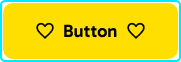


