Default List
Mobile: View design
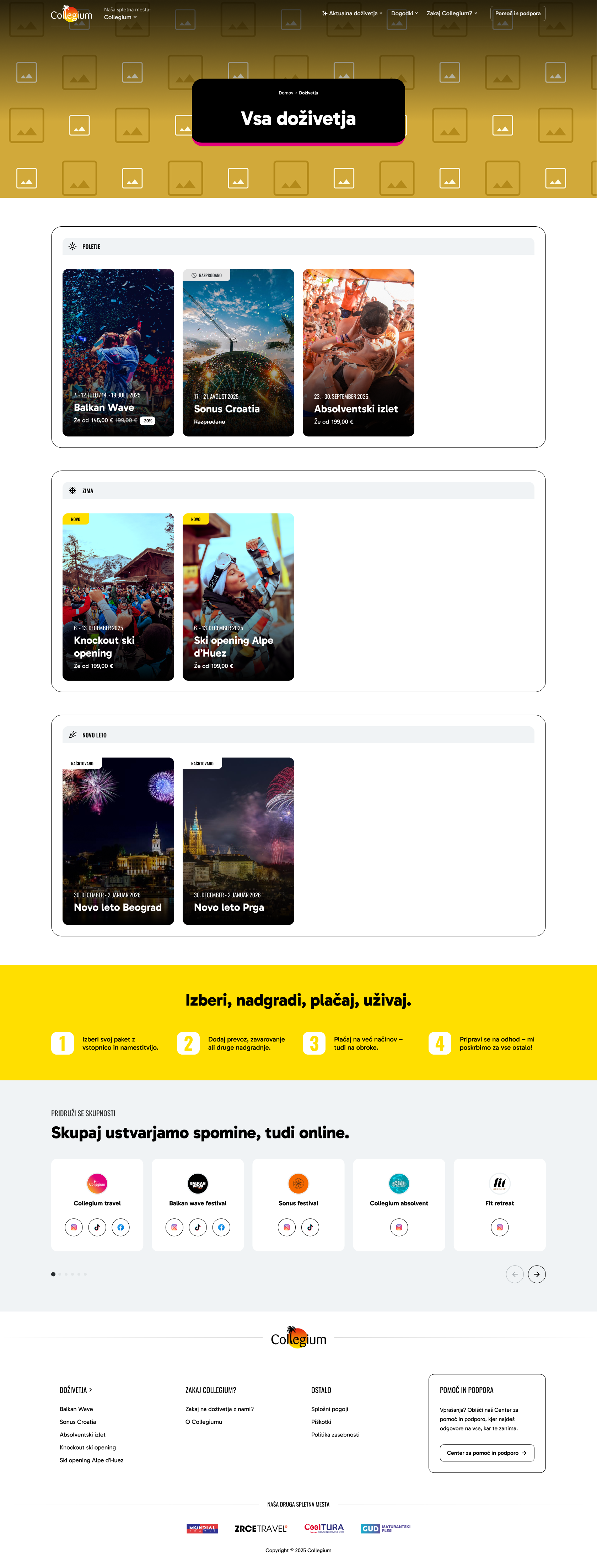
Desktop: View design
Last modified with commit 508b812 on
by Sara Deric.
Default layout for list/archive pages displaying filterable content collections. Used for experience archives, blog posts, event listings, and other content categories.
Components
| Name | Description | Mode |
|---|---|---|
| Header | The Header component provides site navigation and branding. Shows brand logo, website switcher dropdown, main navigation menu with dropdown submenus, optional CTA button, and responsive mobile hamburger menu. Main navigation supports up to 2 levels of navigation (main items + one level of submenus/dropdowns). | global |
| Sub Page Hero | The Sub Page Hero Section displays a hero banner at the top of subpages with breadcrumb navigation and large heading text. Features full-width background image with gradient overlay and centered text card with brand-colored bottom border. | fixed |
| Experience Archive Categories | The Experience Archive Categories component displays category filters or navigation for browsing experiences. Shows category names with counts and links to filtered views. | fixed |
| Icon Boxes | The Icon Boxes component displays a grid of numbered icon-based process steps. Shows the booking flow steps (choose, upgrade, pay, enjoy) with optional CTA button. | module |
| Social Media Cards | The Social Media Cards component displays embedded social media posts or links to social media profiles. Shows cards with social media platform branding, content previews, and links to full posts. | module |
| Footer | Multi-column footer section with site branding, navigation links, support information, and related site logos. Adapts across different brand sites (Collegium, Mondial, Collegium CRO, Cooltura) and responsive breakpoints. | global |