Button
Figma Component: 21141-700963
GitHub Issue: #6
Last modified with commit 449aa34 on
by Sara Deric.
The button component is the primary call-to-action element used throughout the site. It can navigate to internal pages, external pages, anchor links on the same page, or trigger actions such as form submissions. For buttons with icons, editor can select icon from a predefined list of available icons.
Properties
State (Variant)
| Value | Example |
|---|---|
| Default |  |
| Hover and Active |  |
| Focused | 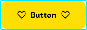 |
| Loading |  |
| Disabled |  |
Appearance (Variant)
| Value | Example |
|---|---|
| Filled | |
| Outlined |  |
| Text |  |
Icon placement (Variant)
| Value | Example |
|---|---|
| Both sides | |
| Right side |  |
| No icons |  |
| Icon only |  |
Size (Variant)
| Value | Example |
|---|---|
| Large | 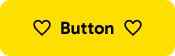 |
| Medium | 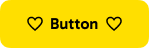 |
Special (Variant)
| Value | Example |
|---|---|
| Play button |  |